One of Australia’s leading banks, ANZ is a global organisation of around 40,000 people. With over 200 designers and 2,000+ front-end developers in its retail division alone.
Starting in 2020, I founded and scaled the bank’s design system and enablement team. Evolving it from a grassroots initiative into the core infrastructure powering product delivery across the organisation.


Try it for yourself
Becoming the bank's first
Head of Design Systems
As the system outgrew it's side-of-desk status, the bank formalised my role as Head of Design Systems. The job involved leading a cross-discipline enablement team encompassing design for iOS, Android and Web — responsible for the system’s output, strategic vision, and delivery backlogs.
It was always a craft role, heavily on the tools and hands on with components; aligning design, engineering and brand to ensure using the system became the easiest and most trusted way to ship.
Team Summary
3 System Squads
5 Designers (direct reports)
8 Engineers
Daily Releases

This timeline isn’t every task I touched — rather the major milestones showing how I evolved the system over time. Each year built on the last in a deliberate way. Elevating basic UI kits into the backbone of ANZ’s digital delivery.
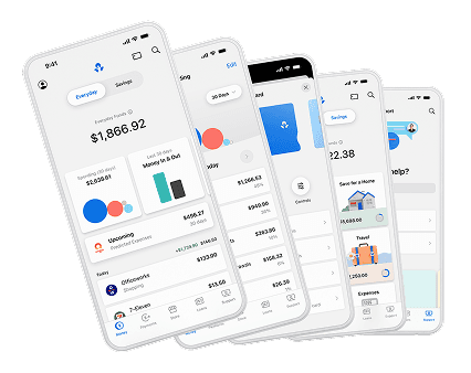
Wallet
Email client
Load / indeterminate
App store
Marketing opt-in
Card details
Empty state
Device notifications
Alert / interstitial
Support pre-load
App update
Goal / rainy day
Digital wallet


Wallet
Email client
Load / indeterminate
App store
Marketing opt-in
Card details
Empty state
Device notifications
Alert / interstitial
Support pre-load
App update
Goal / rainy day
Digital wallet


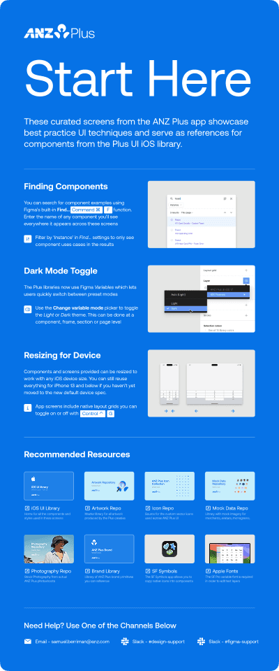
Early on I saw most designers weren't starting with raw components but rather by duplicating existing screens. So instead of building simple pattern libraries, I built out extensive 'sticker sheet' repositories. These resources reflected common flows like: onboarding, authentication, feature discovery, etc.
Each set mirrored across iOS, Android and Web, with best-practice component setup and matching code implementations. Allowing teams to assemble production-ready journeys in minutes, confident that the behaviour and visual language will hold across each platform.
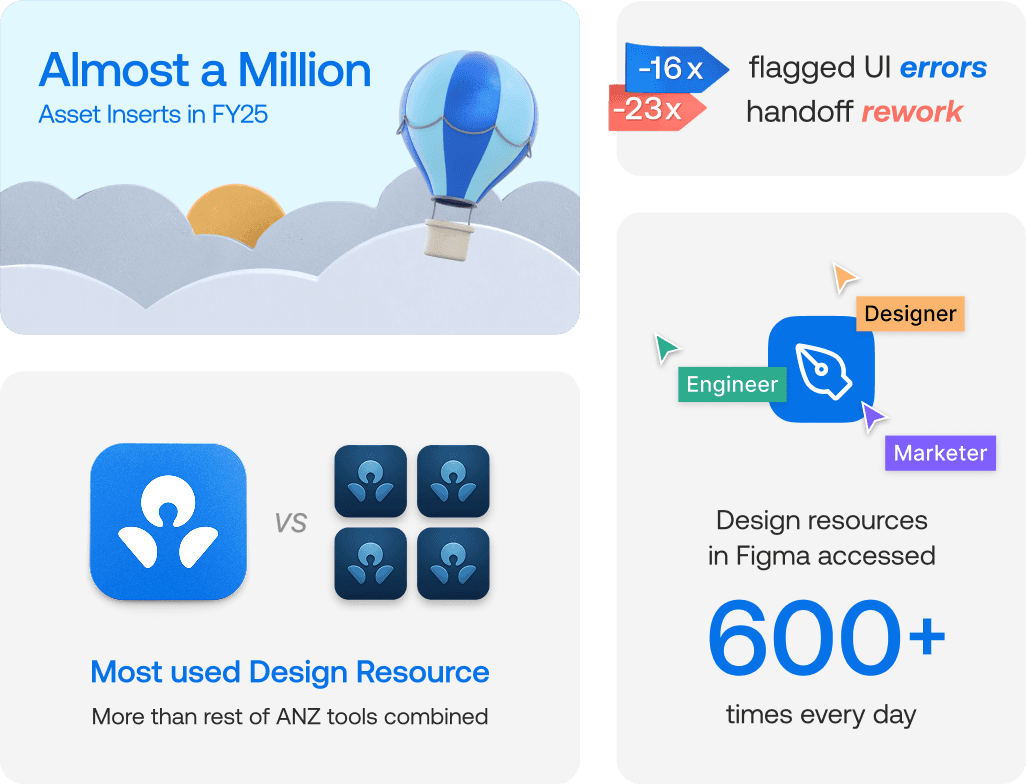
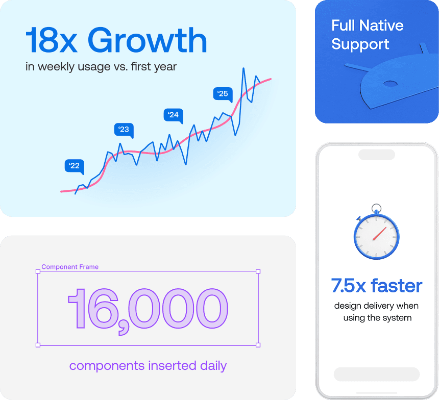
FY25 systems data · Example of round-up visual I routinely produced for executive packs
Prior to my tenure, ANZ had past design-system attempts that over-promised and unfortunately under-delivered. These experiences had scarred the organisation, leaving many sceptical at the value of a dedicated design system function.
Knowing the banking industry’s preference for hard numbers, I always prioritised metrics for everything we shipped. This became a valuation framework that allowed me to confidently prove our value through: quantitive usage analytics; live benchmarking exercises; user sentiment scorecards; and ROI formulas linked to cost-centre data.
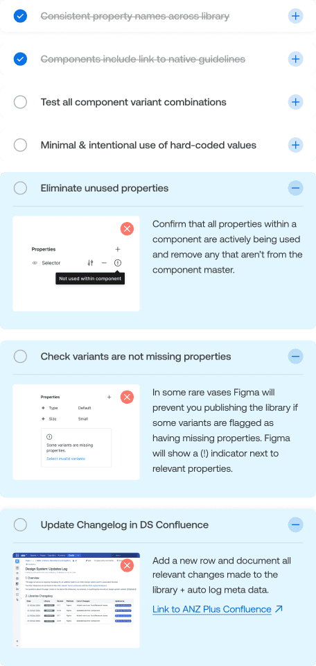
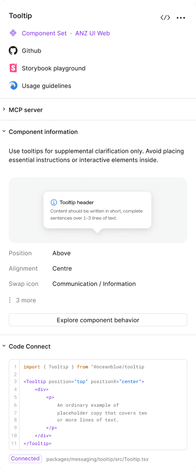
Our component 'best practice' checklist, one of our contribution resources
Design and code always linked to a single agnostic source-of-truth
Having never been a fan of mandate-led governance, I encouraged teams to onboard partially and at their own pace. This lowered the barrier to entry for teams that would otherwise have resisted a blanket rollout. Converting early users into advocates in addition to helping expand the system's reach into adjacent functions with limited compatibility.
It took time (understatement of the year), but project work now starts with the system. Teams inherit tokens, accessibility standards, mock data, and production assets by default. Marketing teams & agency partners self-serve collateral instead of queueing requests. System fluency is recognised in performance reviews, and contribution is seen as a marker of craft. The system has become shared infrastructure that silently accelerates delivery.
Other hats I wore on the job

Vendor Tooling Partner

Icon Creation & Publication

Production Resource Owner
Curated Marketing Artefacts

Head of Digital Brand

Technical / Dynamic Prototyping